
Component: Button Grid
The Button Grid component places a grid of buttons on the page that can be used for use cases such as donation CTAs or secondary navigation.
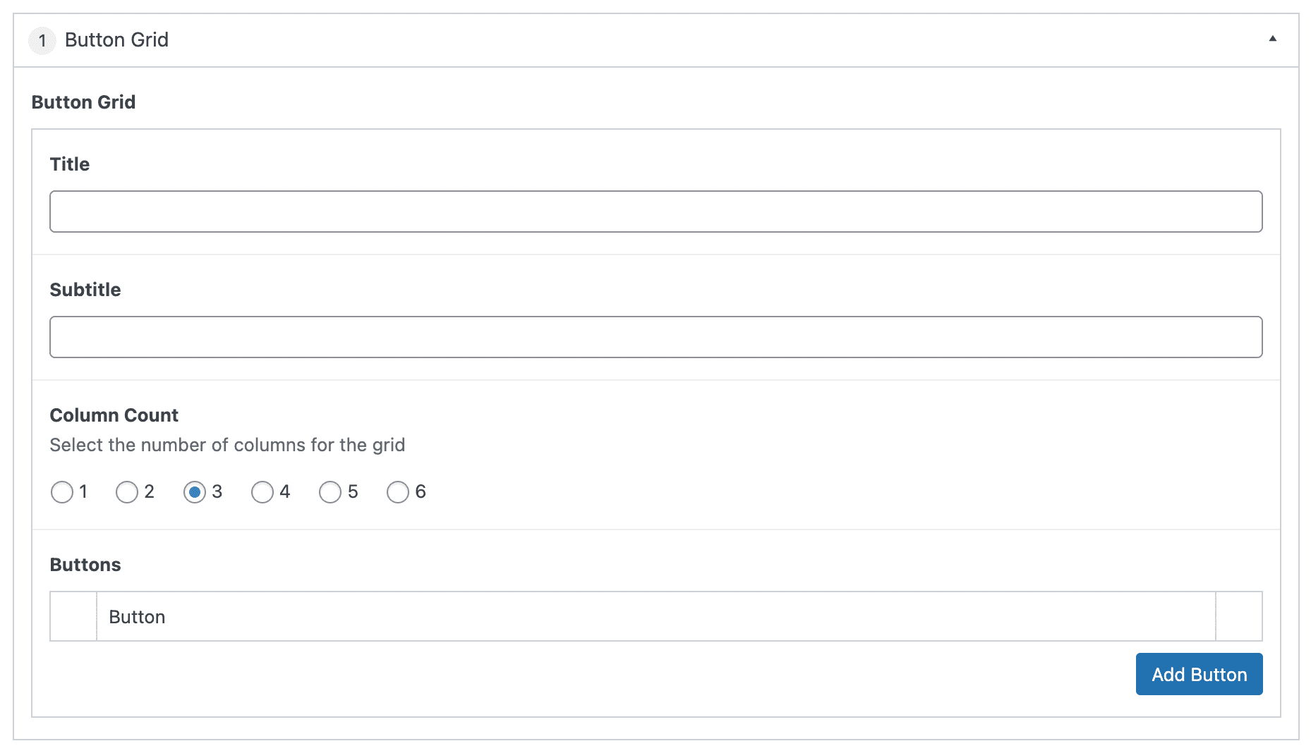
Settings
Button Grid
The top section of the component contains the settings and information that applies to the overall component.
Section Title
The text that will be displayed at that top of the component. This field is optional.
Section Subtitle
The text that will be displayed underneath the Section Title. This field is optional.
Column Count
Selecting a number designates how many buttons will show per row in the button grid. Default is 3 columns.
Buttons
Select the “Add Row” button to add buttons to the grid.
Additional buttons can be added by selecting “Add Row” or selecting the “+” in the right side bar. Alternatively, the button can be removed by selecting the “-” in the right sidebar.
The order of the buttons can be modified by clicking and dragging the left side bar and releasing in the desired position.