Component: Featured Cards
The Featured Card component provides a horizontal scroll presentation for up to 20 cards. Each card can link to a piece of content native to your site (such as a page or form) or link out to an external site (like a donation form or YouTube).
Working with Featured cards
By default, this component needs a minimum of 3 cards to be used. The card order can be reordered by clicking and dragging the the light grey bar that contains the card order number, then releasing it in a new location.
To add additional cards, select “Add Row” at the bottom of the component or select the “+” on the right side on the dividing line between cards. Additionally, cards can be removed be clicking the “-” on the right side of the card item.
Settings
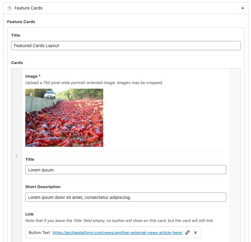
Component Title
The title of the component that will displayed on the page. This field is optional.
Card Image
The image that will be displayed as the background of the card. This field is required. Upload images that are approximately 750px wide and portrait orientation for best results. All images should be the same size. However, the platform will auto-crop images that are not the same size to in an attempt to make all the images in the Featured Card component “look” the same size when displayed.
Pro Tip: You can control the height and look and feel of the cards by experimenting with aspect ratio. Try images that have a 3:4 aspect ratio for rectangular cards and 1:1 aspect ratio for square cards.
Card Title
The title that will be displayed on the individual card. This field is optional.
Short Description
The title that will be displayed on the individual card. This field is optional.
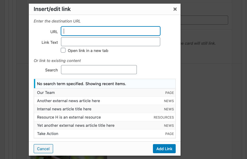
Link
Providing a link allows you to connect the card to content on your site or externally. When linking the card, you have an option for a button to display. If the “Link Text” field is left blank, no button will display, but the entire card will still be “clickable”.