Component: Image Grid
The Image Grid component places a matrix of photos on the page that can be used for use cases such as a photo gallery, staff photos or logo grid.
Settings
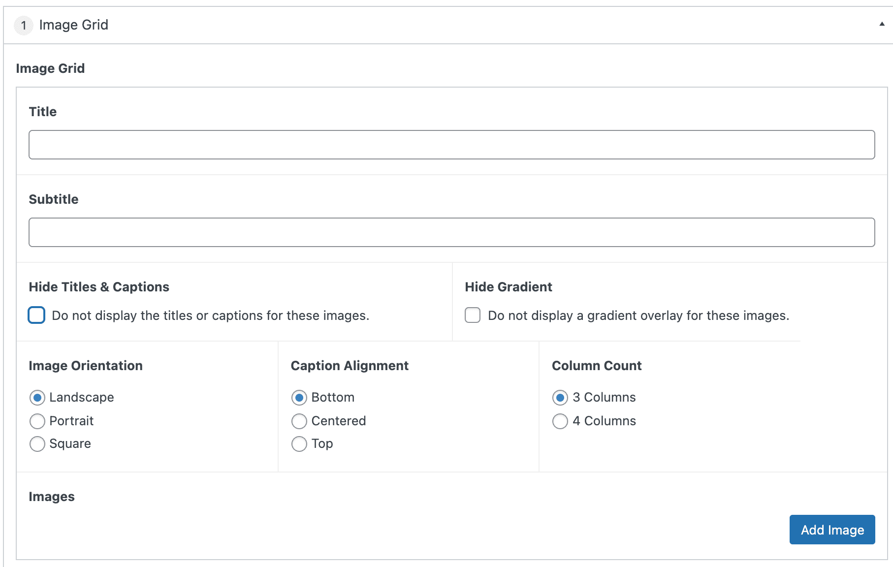
Image Grid
The top section of the component contains the settings and information that applies to the overall component.
Section Title
The text that will be displayed at that top of the component. This field is optional.
Section Subtitle
The text that will be displayed underneath the Section Title. This field is optional.
Hide Titles & Captions
Enabling this feature (by checking the box) hides all the text associated with the images (whether the individual image has text entered or not). This setting applies to all images in this instant of the component.
Hide Gradient
Enabling this feature (by checking the box) hides the subtle gradient style shown behind text to make it more readable. This setting applies to all images in this instant of the component.
Image Orientation
Selecting Portrait, Landscape, or Square determines the orientation and formatting style applied to all images in the grid. Default is Landscape
Caption Alignment
Selecting Top, Middle, or Bottom determines where the text will vertically align on top of the image. Default is bottom.
Column Count
Selecting 3 Columns or 4 Columns designates how many images will show per row in the image grid. Default is 3 columns.
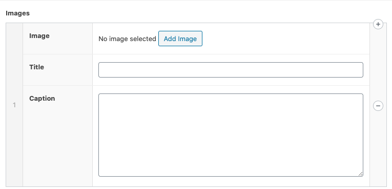
Images
Select the “Add Row” button to add images to the grid. Title and Caption fields are optional.
Additional images can be added by selecting “Add Row” or selecting the “+” in the right side bar. Alternatively, the image can be removed by selecting the “-” in the right sidebar.
The order of the images can be modified by clicking and dragging the left side bar and releasing in the desired position.