
Component: WYSIWYG Columns
The WYSIWYG Columns component combines the flexibility of the WYSWYG Editor component with the structure of columns. This component provides two to four columns.
Working with WYSIWYG Columns
Once you’ve added the desired number of columns, entering Column Content into the editor is same as using the WYSIWYG Editor component.
Settings
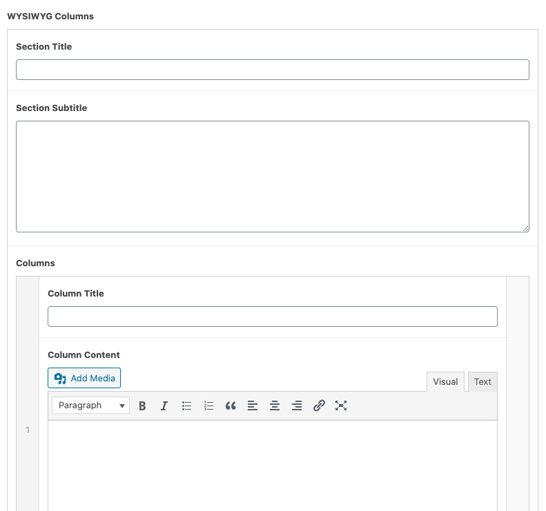
Title
The text that will be displayed at that top of the component. This field is optional.
Subtitle
The text that will be displayed underneath the Title. This field is optional.
Column Title
The text that will be displayed at the top of each column. This field is optional.